Home > UX Design > Margaret Plumley's Process
Process
User Experience to me is not just about where you put the buttons; it is the entire experience from end-to-end starting with the feature set. No matter how gracefully your buttons are organized, if you build the wrong thing, you are not creating a good user experience. Design is a fluid process with a lot of design-test-rinse-repeat, but starts with some very important preliminary steps. (Please note that this is just an overview of my process, and not meant to be a detailed tutorial.)
Define the goals and users (and non-goals and non-users)
What are you trying to achieve this version? Who are you building this for? Who are you not building this for? Answers to these questions will define which features to target.
Define key scenarios
For example:
"The user should be able to:
- Run an existing scenario.
- Join or host a multiplayer session.
- Change general settings such as graphics."
Use these to target your efforts and also to define your usability studies.
Get sign-off on goals, users, and scenarios
Before you make your first prototype, get consensus from all parties on the goals, audience and scenarios. These should all be derived from the product’s vision, and if there are disagreements around a course of action in the future, come back to these to determine the correct course.
Once you know what you are building, then you can start to design it.
Work with development
You need to understand the implications of what you are proposing. Working with development throughout the process gives you a sense of the benefits and limitations of the technology and prevents surprises later on. Developers also often have good ideas!
Weigh costs with benefits
Once you understand the technology and the implications of your decisions, you can weigh the costs of your features with the benefits. UX is a feature and every feature gets weighed: Is it worth an extra two weeks of developer time to make something behave a certain way? Sometimes it is. Sometimes it isn’t. Sometimes you need to take a stand, and sometimes you need to be realistic. This is why it’s important to know your business goals up front.
Roadmap
Understand what’s going to happen in this version vs. the next version vs. the next. If a certain area is going to be completely rebuilt in the next version, then you may be better off concentrating your efforts elsewhere. Sometimes it's worth the effort to put time into something that's earmarked for replacement, but this should always be a conscious decision and not an accident.
Create visuals
Visuals serve two purposes for me: They are a thinking tool and a communication tool. Prototypes help me think through the experience: As I click through the scenarios I realize what’s missing or what could be improved. I iterate through the first few prototypes very quickly because I am thinking through the process and changing things as I go. I often use PowerPoint at this stage because it’s simple, fast, and allows me to put questions and notes to myself either in comments or in the Notes section of the individual slides.
Visuals are also an important communication tool for doing walkthroughs and providing guidelines for dev.
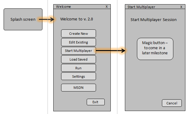
First draft = “Thingy and flow”
My first round is what I call my “Thingy and flow” model. I also call this my “ugly prototype” and it consists of boxes showing “There is a thingy here and when you click it you go there.” The purpose is to nail down the elements and flow between them without getting hung up on colors, sizes, placements etc. These are great for group reviews since they force people to focus on the relevant parts and not get sidetracked by colors and buttons. I do these early and walk through each key scenario with PM and dev to make sure there are no hidden issues such as load times or needing to call another application before being able to complete a certain function.
Below is an example of a “thingy and flow” walkthrough. In the actual prototype each of the boxes would appear as separate slides and the buttons would be linked to the correct slide, allowing me to actually click through the experience.
Ideation & design spec
After signing off on the flow I would start working through the actual screens. The first few drafts of this would go very quickly as I am often working things out in my head. As I go through this process I often uncover user requirements that are not mentioned in the spec. I cycle with PM on these in hallways and doorways, and then write a design spec. It’s easy to smile and nod at wireframes, but sitting down at a table and walking through a spec codifies it. There will invariably be open issues and changes, but the spec review acts as a forcing function and puts everyone on the same page.
Iterations
My actual design iterations are sometimes just different ideas, sometimes based on the technology limitations, sometimes the result of discovering limitations in the previous version, and sometimes the result of the technology changing under my feet. Throughout the process I experiment with variations. Ultimately it all boils down to: Does it solve the problems?
My iterations are fluid and I don’t always save each one as they often evolve as I’m working. The variations in the examples below are mild rather than radical since this particular product needed to look and feel like Microsoft Enterprise software; if it resembled a game or a consumer product then the potential customers wouldn’t take it seriously.
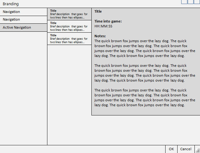
Modified "c-clamp" design using dialog box forms but allowing for a second layer of navigation.
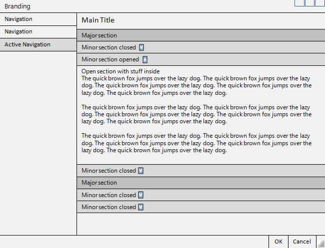
Modified "c-clamp" design with open/close sections.
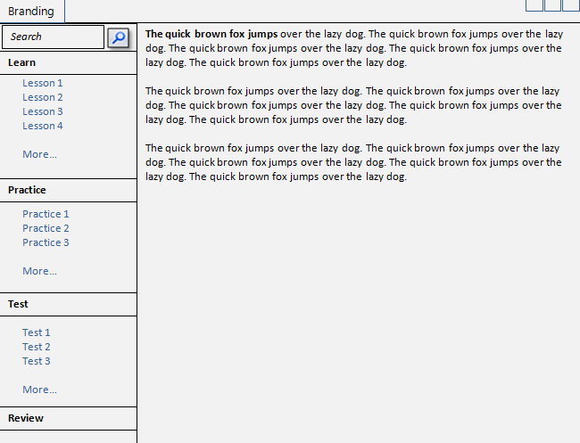
Web-like version with "top 3" links and "More."
Two levels of navigation stacked with open/close.
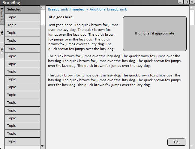
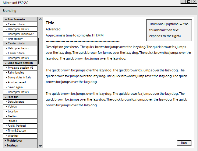
Main and 2nd-level navigation on the left with breadcrumbs if needed; primary navigation folds.
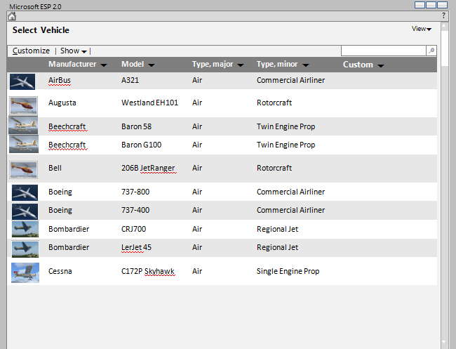
Table view of Vehicle Select (compare to Preview view below).
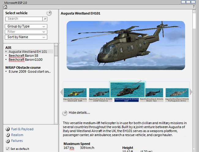
Preview view of Vehicle Select.
Finally, an example of how I would approach this case differently if it were a game:
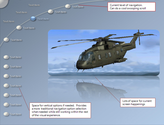
Design language
The comparison of the game-version to the gray-box version illustrates the importance of the design language. This is not the same thing as the final design, but rather is a general look and feel: “Gray boxes on the left” vs. “blue ovals in an arch.” This should be driven by the business goals (e.g. sexy game vs. Enterprise Productivity Application), and while it will not impact the flow, it will impact the design: If you are working with a UI widget set of gray boxes, then they will invariably get stacked.
Templates
You don’t want every screen to look completely different - that creates an inconsistency in the experience and forces the user to learn more. It also creates more dev work. Once you have an inventory of all of the screens and a solid sense of the flow (and thus the levels of navigation), you can build out general templates.
UI scrub
Finally, just because it shipped before, doesn’t mean that it’s OK to ship again. Also, by virtue of adding new features you are changing the game and may need to rethink the old flow and screens. For these reasons it’s important to look at the whole product and not just the new parts. Which brings me back to my original statement: User Experience to me is not just about where you put the buttons; it is the entire experience from end-to-end.