Home > UX Design > Solucient Market Planner Plus
Solucient Market Planner Plus (2002)
Problem: The existing product was so complex that the sales rep would sit down with the customer and create the reports for them. The UI offered no information about what the different parts of the product did, or how the user was supposed to use them. Also, because the company sells data, they wanted to both remind the users of the great data that they are getting, and encourage them to upgrade to "higher" levels.
Solution: Information at the time of need: Add enough UI text that the users can tell what the different functions do and how do use them, and walk them through the steps. Also provide UI cues about the data available - both the data that they are currently getting, and the additional data that they can buy.
Process: It's a niche market, and there were no customers near me, so I relied on talking to the Product Manager, who had worked on the product for many years. I interviewed him on who the customers are, what their goals are, what their complaints are, and what his goals for the product were.
Then I started mapping out the flow - there are a lot of screens and steps in this product, and I needed to know how many and how they connected. I created a Visio diagram of the flow, which the entire team then reviewed.
Then I built clickable mockups of each screen. At this point I encountered two additional complexities. First, the team was spread out over the country in four different cities and three different time zones. Second, the application pulls data from a database over the web, so you need to make sure that the process not only supports the users, but also the architecture. To address the virtual team issue, I made the mockup out of individual HTML pages. This allowed each screen to have a unique URL - which we could easily refer to, and send around in e-mail - and also made sure that everyone knew where the latest version was (i.e. it's not version x of a PPT deck or a Flash demo; it's the pages on the site). It also allowed me to update the screens quickly, often in real time during a conference call. I then made sure that the database administrators and the developers reviewed the steps to ensure that the design met their requirements (in fact, we did change some of the flow to lighten the load on the database).
For the second round of prototypes, I added some cleaner graphics and took a closer look at all of the elements (not just the database). For example, because users pay for the service, we wanted to include information about the features that they don't own to act as marketing upsell.
The final prototype included final flow and UI design elements, as well as the icons from the graphic designer.
Results: According to the product manager, "This is the first product that our customers tell us that they want to use."
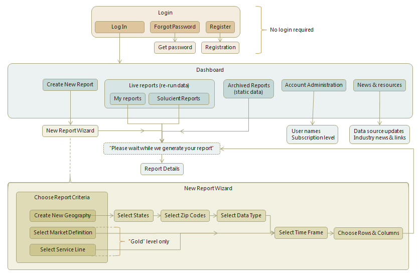
Initial Flow
An early flow diagram; the final product was more complex than this:
Initial design
Remember, this is back in the days when a link was blue and underlined, so the orange underline is going out on a limb. These are the initial pages that I did when we were still working through the information architecture and feature set. (All visuals mine)
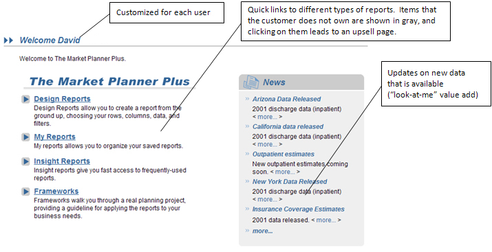
Welcome screen
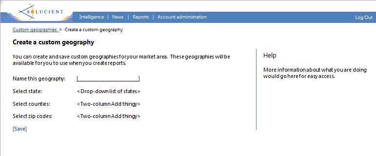
Click "Custom geographies" and land here:
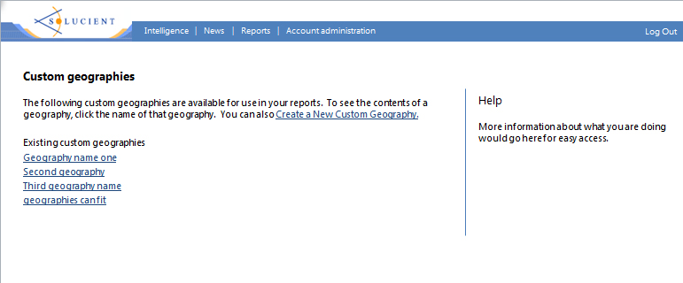
Click "Create a New Custom Geography" and land here:
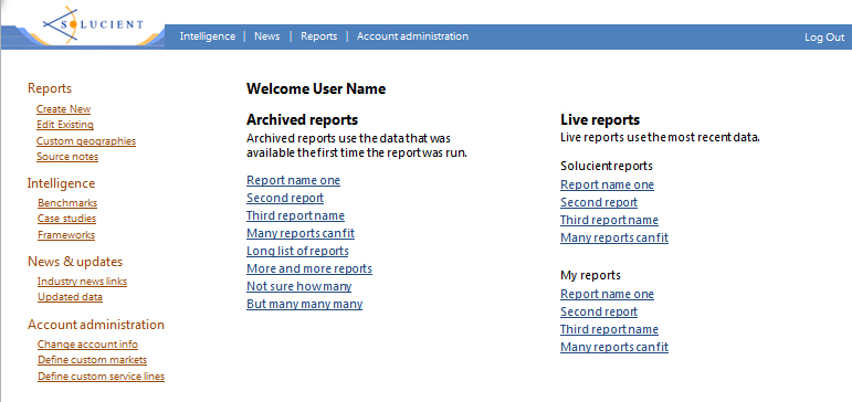
Final pages
We went through several iterations based on both the impact on the database and collaboration with the Product Manager on user needs, product requirements, and usability.
Welcome screen:
(Visual design done by a graphic designer)
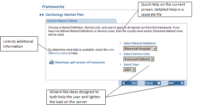
Framework Builder:
(Visual design was done by a graphic designer)