Home > UX Design > Tecplot Chorus
About Tecplot
Tecplot is a scientific visualization company whose software is used in aerospace, oil and gas, bioscience, and everywhere you need to visualize fluid dynamics. A small company (45 people when I was there), the interpersonal dynamics are an important part of being there: The company motto is "Do the right thing," and it's not just a poster on the wall.
My Role
My job was to bring user-centered design to a traditionally developer-centric company. This included both changing the software development process and actually designing the software. I worked closely with Product Management to define the product, and was a part of the extended leadership team and an active part of planning the roadmap for the product and the company.
The Product
A v1 first-to-market product, Tecplot Chorus allows engineers to analyze large amounts of data easily. Previously, they had been hacking together with scripts and spreadsheets what we would allow them to do with a few clicks. "Simulation Analytics" is the name we coined: The ability to see the results of thousands of simulations at once.
The UI
We were using an open-source UI toolkit, so UI work was limited to sizing and moving existing building blocks.
The Target Users
Rocket scientists. Computational fluid dynamics experts. Highly technical people. Boeing, NASA, and the like. They are designing airplanes and space shuttles and need to know if the design can take the stress. They need to make sure the aircraft won't flip and the tail won't break.
Methodology
As I do with most everything, I made a storyboard of the end-to-end scenario. I do these to help myself think through the scenario, and in this case, I also used it for usability. There was a conference that our key customers would be attending, and I used this as an opportunity to meet with them individually and walk through the storyboard: If they could explain what was happening, then it was successful. The complete storyboard, from importing data, to creating plots, to exploring results and generating a report looked something like this:
Just starting the import wizard looks something like this:
It was worth it. The most important thing to get right in this first product was the flow: Users needed to be able to work seamlessly. They had been gluing together the same thing with spreadsheets, but we were providing them a smoother way to do it, and that was our killer feature. The customers both understood what was going on and were excited about it. Plus, we got some deeper insight into their needs and methods. The only part that they didn't quite get was the shot of surrogate models, and in that case we didn't quite know what we were going to do at that point either, so it was more a way to gather information from them.
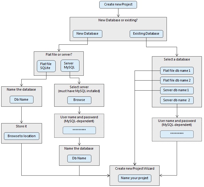
Here's a closer look at what is going on. The first step is data import. It isn't sexy. It's highly practical: They need to be able to either crawl an existing file structure or read a text file. This is key: They can't use our product until their data is in and structured properly. Once it's in, then they can explore. "Exploring" means looking at plots. If you are designing an aircraft and want to know what happens when it gets near Mach 1, then you run a variety of simulations on different wing positions as well as the angle of attack, pitch, yaw, and a dozen other variables. Then you want to see when things go wrong. They are often looking for the red dot: The time and place when something gets too hot, or the stress is too high, etc. Plotting the results of multiple tests shows them patterns and trends:
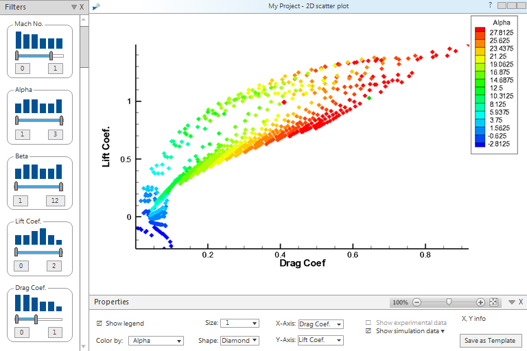
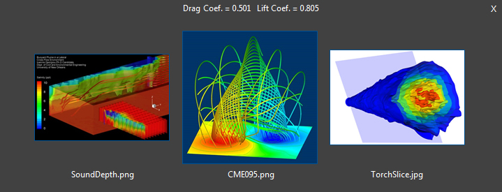
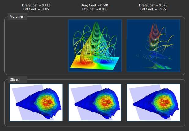
Note that they can set not only the X and Y axis, but also the range of other data that they want to include. From this plot, they dig into individual points to see the data behind those points. This data is usually in the form of an image. These images play an important role: Our customers use them as a way to see the data. Colors and color differences show everything from temperature to pressure to everything else you can imagine. The ability to see the images clearly and accurately is therefore important, as is the ability to compare images. The images themselves were often produced by one of Tecplot's other products (usually Tecplot 360) but Tecplot Chorus allows users to access these images in relation to multiple points of data and provides multiple ways to view images.
Multiple images for a single point:
Multiple images for multiple points, and not all points have all images:
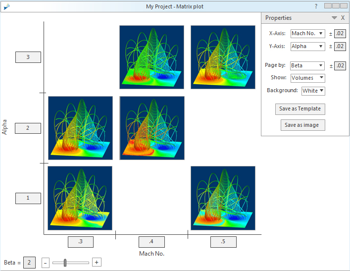
A matrix of images. This is basically a plot of images, and the users can page through the plot by a third variable. Note that in this case the user has the option of white for a background. Since they often need to put their images in PowerPoint presentations, having the ability to save out the whole matrix as a single image saves them the trouble of needing to assemble it by hand, and the ability to select the background color makes it easier for them to have an image that could print well in a paper report. Little things like this made their day: These highly skilled scientists spend way too much time assembling PowerPoint presentations.
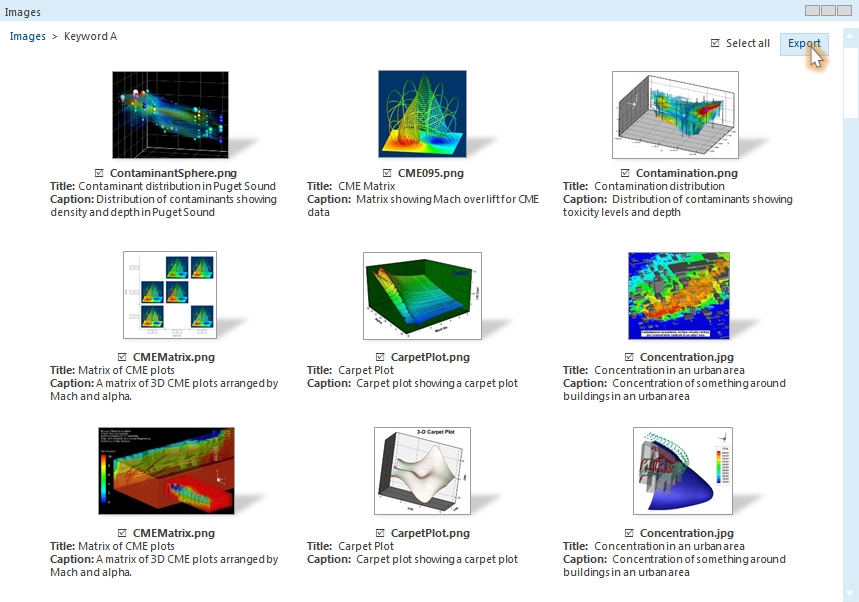
Because the target users spend so much time in PowerPoint, I also designed some ideas for creating and using image libraries. This included ways to tag images with keywords, title, and captions; sort and filter by keyword; and select images for use in a presentation.
Results
Despite the tight timeframe and the usual array of obstacles (and a few unexpected ones), the v1 was a success. According to one customer, “Our post processing productivity increased by an order of magnitude... Now I can do in five minutes what once took me 4-6 hours.”