Home > UX Design > Microsoft Office Word
Microsoft Office Word (Office 12, 2004-2008)
My Role
I was a PM (Program Manager) which is Microsoft-speak for a combination Product Manager/Designer. That means that I'm the one on point to figure out what the product/features should be - including everything from the customer research down to the spec-level details - and then I need to make sure it happens. I've always been focused on the user experience end of software: Do they even want this feature? What about it is important to them? If we only do x and y will we meet their needs, or do we also need to do z? I think it comes down to my feeling that software is a great tool, but it is only a tool. I'm not interested in technology for technology's sake; I'm interested in technology because of what it allows you to do.
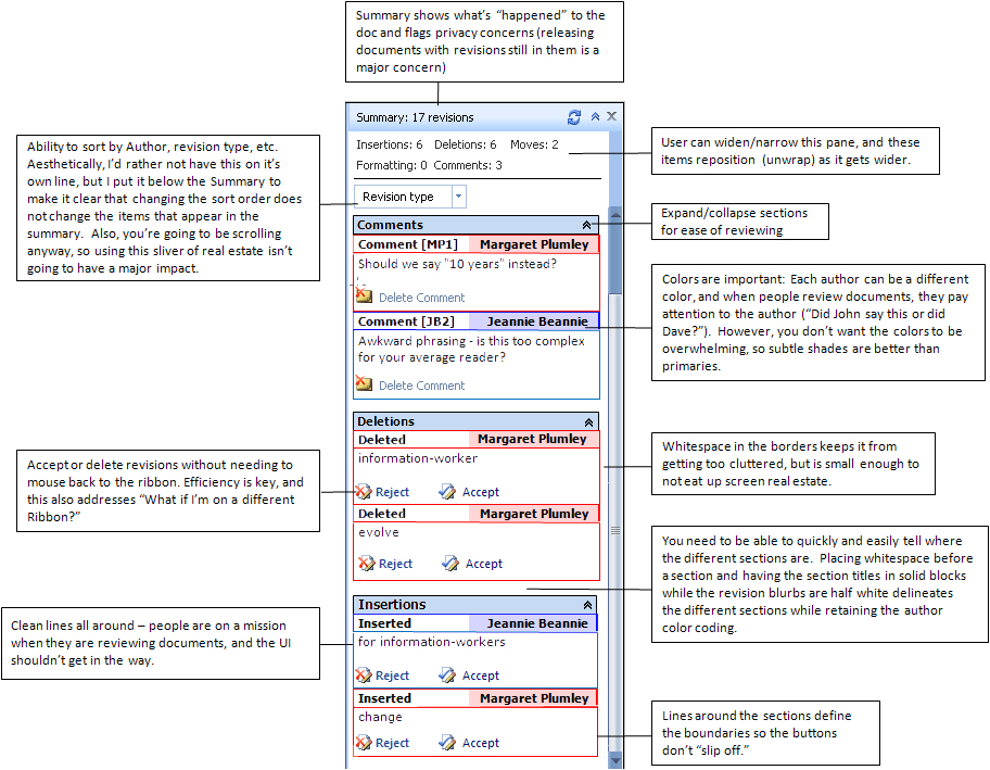
Reviewing pane
Problem: When users receive a revised document, they look at the revisions in terms of who made the revision and what type of revision it is. For instance, when lawyers send out a contract for review, they want to know "What was deleted?" When a legal secretary sends a document out to a number of attorneys for review, she ways to know "What did Jim say?" The current reviewing pane, however, only shows revisions in the order in which they appear in the document.
Solution: Allow users to sort the revisions by author, revisions type, date, etc. The different sections would then be collapsible, allowing the user to work on a section without being distracted. Adding the Accept/Delete buttons to the actual revision blurbs would make it easy for the user to go through all of the revisions without needing to mouse over to the ribbon, then back to the reviewing pane, then back up to the ribbon.
Process: While much of the research work was done at the same time as the compare feature, the reviewing pane has a larger target user base. I therefore spread the net a little wider and made sure that I was hitting those other user needs as well.
Results: Sadly, much of the work was cut for Word 12, although the summary was included in the shipped product.
Document compare
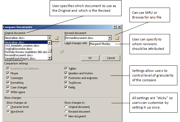
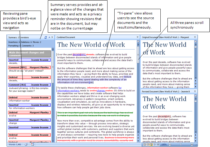
Problem: The existing document compare feature was inadequate causing many Word customers used a third-party tool. The interface for Word made it difficult to tell which of the source documents would be the original and which the revised, and the resulting compared document could not be easily aligned with the source documents.
Solution: The entry UI allows the user to specify which document is the Original and which is the Revised, and the resulting view shows the compare result side-by-side with the source documents. Further, the documents scroll synchronously, allowing the user to easily see how the documents relate. Commands in the ribbon allow the user to who or hide the source documents to meet their own preferences and hardware limitations (i.e. small monitors). I also moved the reviewing pane to the side (instead of the bottom) to better act as a form of navigation, and added a summary, allowing users to see at a glance how many and what type of changes are in the document. The number one requirement was that compare be solid - partly because previous version had been buggy and partly because they are using the feature to compare legal documents.
Process: I spent a lot of time talking to users, looking at the types of documents that they compare, and looking at competing products in this area. We had users identify the most important features, and I used this list to define the success criteria. I then explored various design possibilities through various low-fidelity prototypes (often just paper) and talking to development and planning. The final design was tested via both traditional usability studies and through demos that I did for the set of customers who provided the initial feedback. These demos served to both gather feedback on the product and close the loop with our customers.
Results: Positive feedback from customers, both informally and through usability tests.
Entry dialog
Yup, gray boxes. The UI for dialogs was still primarily in Gray Box land in this era.
Tri-pane view
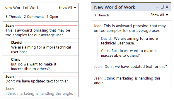
Comment threading
This work did not make the final product for that version, but it's interesting to look at now since the width of the comments pane plays nicely with the form factor of mobile, allowing you to keep the same basic look and change the interaction from buttons to swipes. Here's two different concepts on how to handle threads and easy identification of different users:
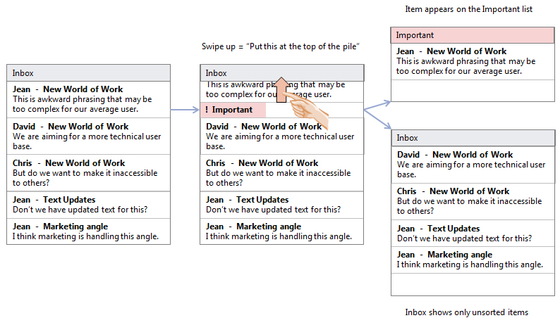
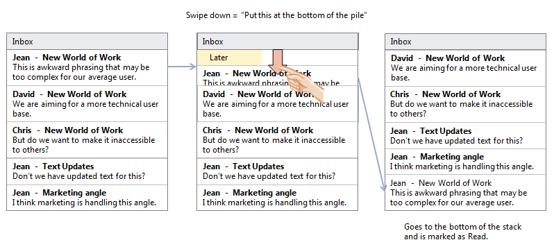
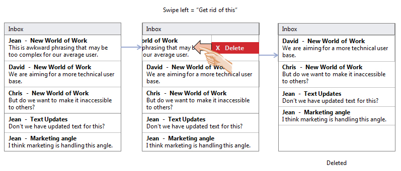
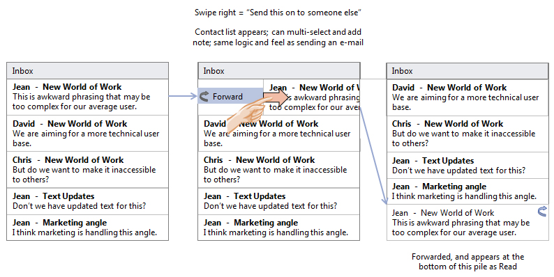
Mobile reviewing
Concepts for dealing with comments on a mobile device. This uses an Inbox model and expands the notion of what you would actually do with comments; it's a different way of dealing with information that includes marking items as Important, saving for later, Deleting, and Forwarding.