Home > UX Design > ESP End-to-End (Flight Simulator development platform)
About ESP (2008-2009)
ESP was a start-up group inside ACES studio and the product itself grew out of the Flight Simulator platform: A simulation environment which modeled the world in great detail and allowed users to modify and expand it. The product itself was quite complex and consisted of a variety of tools and plug-ins for all different users ranging from artists to developers.
My Role
I was officially a UX Designer, although as one of my cohorts pointed out, "PM is stamped across your forehead." I'm sure he meant that in a loving way. Actually, I think he meant that after years of being a project manager, I can't just push the pixels; I look at the bigger picture of both the product and the development process. Things like, "Hey, has anyone else noticed that this same functionality appears in three different applications? Should they be shared? Can they be shared?" I was primarily responsible for the end-to-end experience, but also did some initial brainstorms on the 3D simulation environment. My work on the end-to-end is below, you can read about the 3D environment here. You can also read about my process.
Basic Launcher
Goals: Create a way for users to run simulations out of the box. The product is a platform, so we expect them to create their own launch environment, but we need to provide a starting point. This needed to not only provide functionality, but also be skinnable (for rebranding) and modifiable for those customers who did not want to build their own complete environment.
I was responsible for the User Experience for the entire Launcher experience. One of the first things that I needed to do was to identify what we were building vs. what we were enabling, and part of my work for UX was to make sure that we were enabling the correct things even if we were not building them.
A simplified flow of the Launcher as a whole looks something like this:
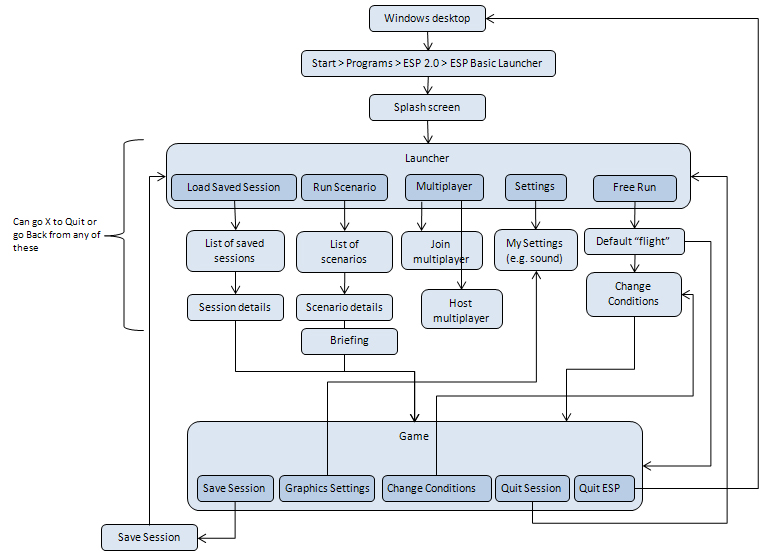
The "Change Conditions" box is actually an entire complex flow in itself.
It's also important to note that within the course of a single user task (e.g. "Practice flying this vehicle") the user flow crosses several applications, some of which would be in-the-box, some we would be providing hooks for, and some would be created externally, but displayed within the Launcher:
I also needed to differentiate between what a solution provider/developer could do with the launcher vs. what an end user was expected to do. For example, while an end user could add or remove items from their Favorites or rearrange the columns in a table, only a developer could change the menus or reskin the application.
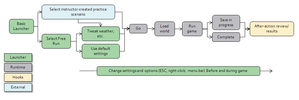
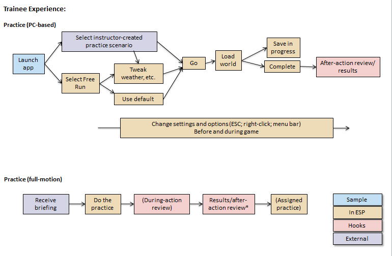
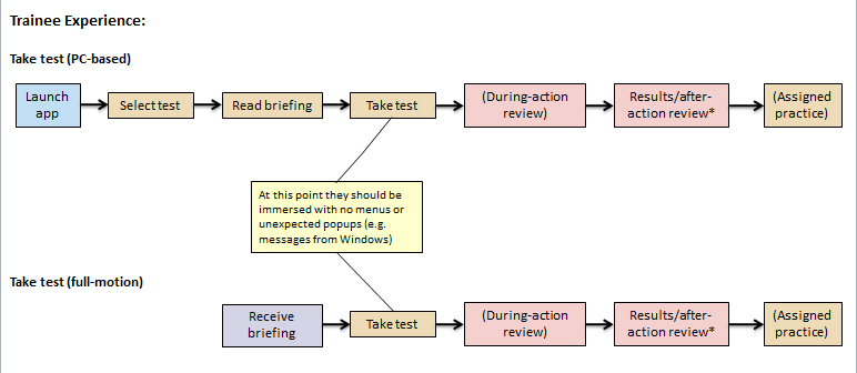
Because the training process varied depending on whether you were in practice mode or taking a test (namely if you got to change the settings) and whether you were using a full-motion simulator or a laptop, I did simple flow diagrams to show those differences:
Launcher UI
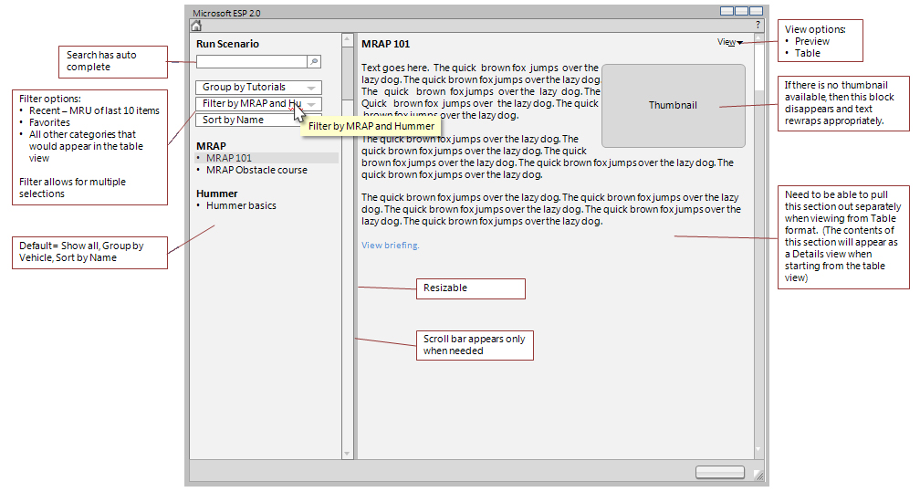
Because of the variety of tasks that the user does from within the Launcher, the fact that solution providers will be able to reskin it and modify the menus, and the fact that any new scenarios which they create will appear in the list of scenarios along with the ones in the box, one of the challenges was coming up with a design that was flexible enough to allow for extension and modification and yet would provide consistency throughout the out-of-box experience. I went through several iterations, the final one (before the product was cut) was to have a Preview Mode and a Table Mode.
Preview Mode
Goals:
- User can quickly graze through options and see details about them
- User can Filter and sort the available options
- User can quickly access Favorites and Recent
- User can search for specific items
- Flexibility in the Preview Pane: There may be no thumbnail and the amount of text in the Preview Pane may vary greatly
- Flexibility in the List Pane: Customers may add or remove items and create their own categories
The default view when you start the Launcher would be a modified version of Preview Mode set to show Favorites and Recent items:
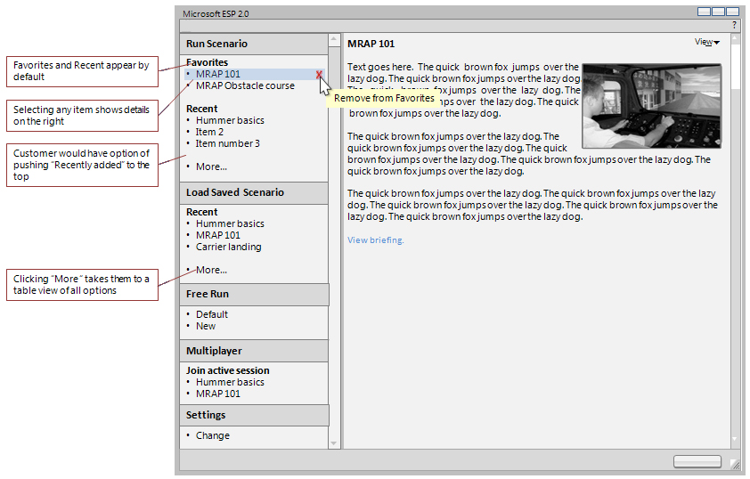
Clicking on any item would show details in the right side, and clicking "More" would take the user to a table view showing all available options. This transition is the part of the user experience that I would most want to test through dynamic prototypes and usability.
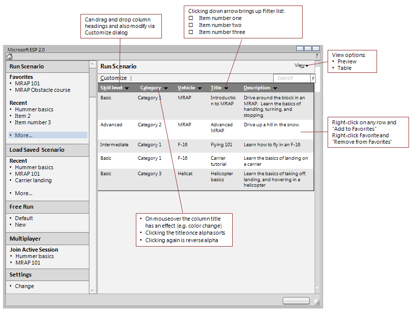
Table Mode:
Goals:
- One-click access to everything (not elegant, just quick)
- User can Filter and sort the available options
- Flexibility: Customers can add and remove scenarios and categories
Free Run Conditions
Challenges: These are essentially the Free Flight conditions that you see in Flight Simulator, with the added complexity that the same dialogs are not only shared with Flight Simulator, but are also used in three places within ESP: The Basic Launcher, the runtime, and the Scenario Editor. The design, therefore needed to be flexible enough to allow for use in each of those environments. Some of the flows within each of the sections was also quite complicated. The options available to the user to set include: Vehicle, Fuel & Payload, Realism, Realism, Failures, Location, Time & Season, and Weather. Within each of these there are a variety of settings. Below is the initial Select Vehicle screen, since this is one of the more intertwined sections (not only does it have several levels of its own, but it is also shared across ESP and Flight Simulator):
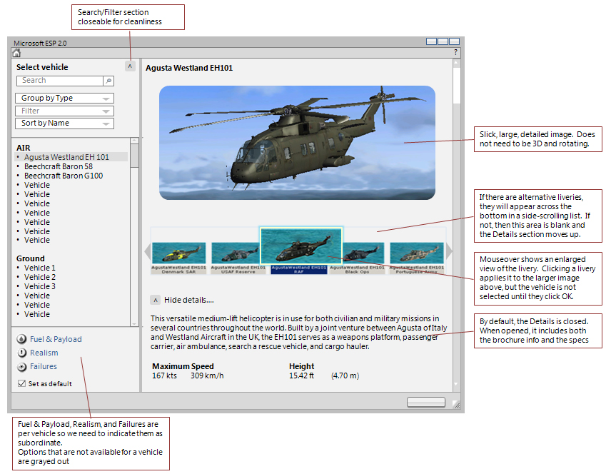
It is a complex screen, and I think perhaps a little busy, but all of the elements are required. I tried to make the left side less busy by making the Sort/Filter options collapsible (this would also provide more room vertically for a longer list). This is another section that I would want to build a dynamic prototype for so I could get a better feel for working with it.
I was quite sad when the product was cancelled, since not only was it a fun, fascinating, and complex piece of software, but it was also a great group of people.
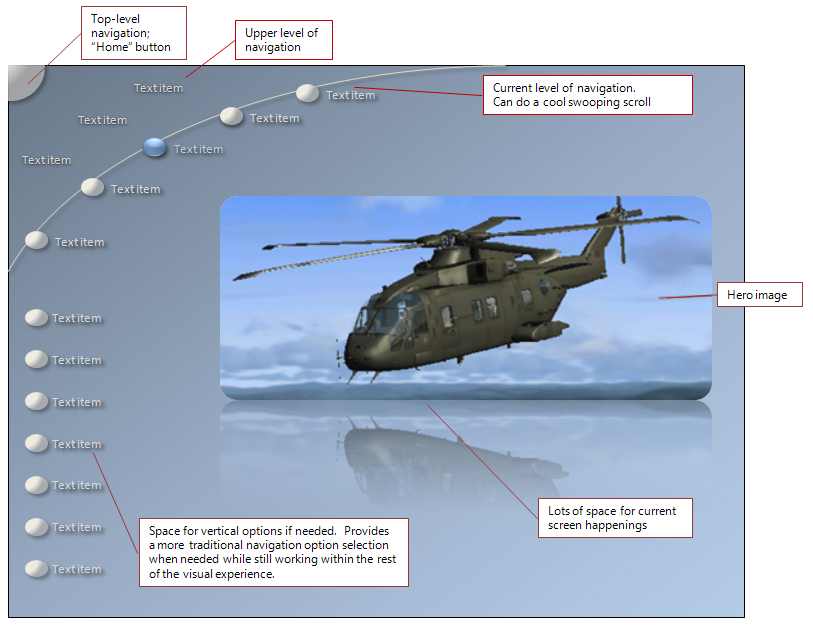
If it were a game...
If I were working on the consumer game flavor of flight sim (rather than the enterprise simulation flavor), I would start by creating a toolkit of design elements and gestures. Not the actual design itself (you paint yourself into a corner if you start with the design and try to stuff the experience into it)5, but design elements. I would want something that said "flight" and "motion" far more than a gray box would, so arcs would be a good starting point. I know that I need several levels of navigation as well as options within a level, so I would need a design that would support this. I also have a lot of visuals, not just lists, so a large area to show off the images. Below is an example of what would be my starting point, and I would then work through all of the design problems to see how they fit or how the design needed to be altered.
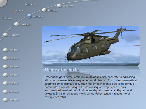
With placeholder text (compare with gray-box layout above):
For additional design iterations, see the section on my process.